GoCardless Remember Me Components#
GoCardless Components is a JavaScript component library aimed at providing GoCardless integrators with customisable functionality for creating checkout flows without the need to build their own from scratch using the API.
This document explains how to integrate the Remember Me components into your checkout flow.
1. Prerequisites#
1.1. Billing Request Setup#
Remember Me components require a valid Billing Request ID to function. Ensure you can:
Create billing requests via the GoCardless API
Pass billing request IDs to your frontend
Fulfil billing requests from your backend
If you haven't created a billing request yet, see the GoCardless API Documentation .
1.2. Requirements#
Before implementing Remember Me components, ensure you have:
Active GoCardless Account with the GoCardless Components upgrade activated
Contact your implementation manager to enable this
Public Token with appropriate scopes
To generate a public token via the dashboard, go to https://manage-sandbox.gocardless.com/developers/public-tokens and do the following:
Select Create public token
Enter a Name to identify this token
Provide the Domain where you will be using the GoCardless Component
Tick the ui_components_remember_me scope
Click Create
Billing Request implemented
Must have an existing billing request created
2. Components#
2.1. Component Types#
GoCardless provides two Remember Me components:
ReturnFlow Component#
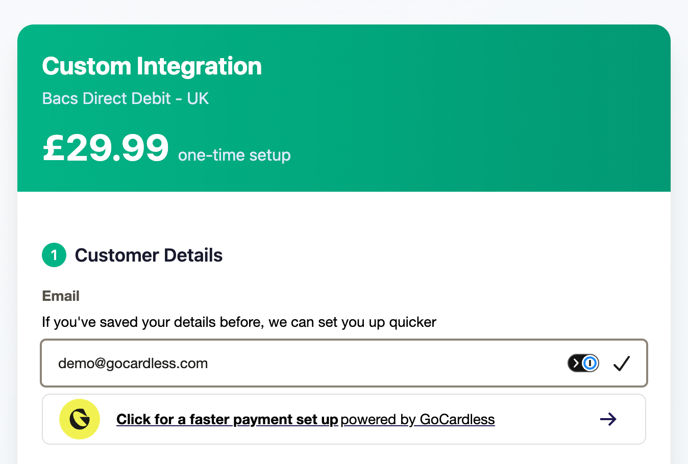
Used at the start of checkout to recognise and verify returning customers who have previously saved their details with GoCardless.
Use when: Customer enters checkout flowPurpose: Recognise customers via email and complete verification to pre-fill payment detailsRecommended location: Top of checkout page, before any form fields
Signup Component#
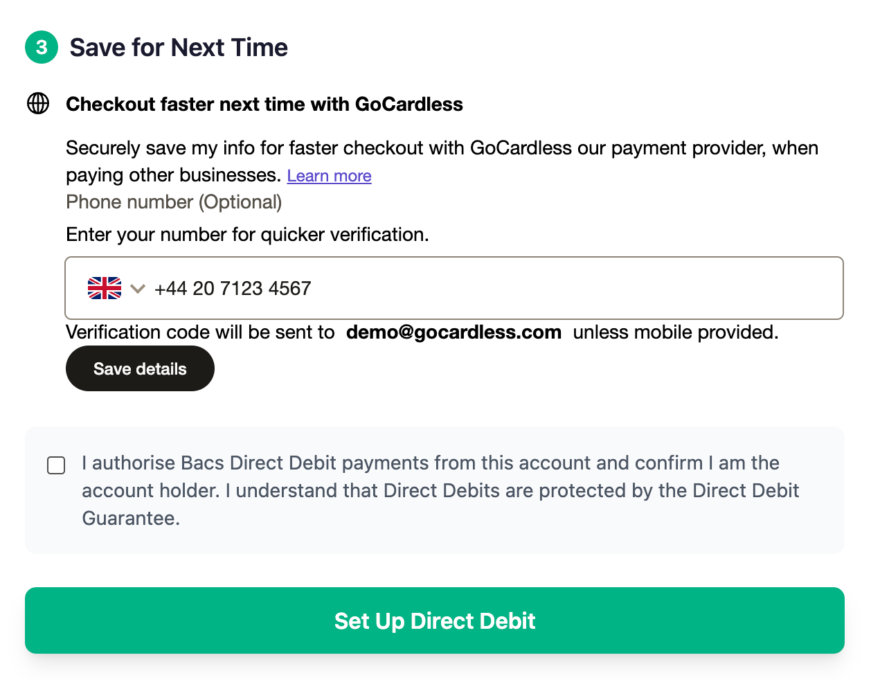
Used during checkout to allow new customers to opt-in to saving their details for future use.
Use when: New customer completes payment or at any point in the checkout flow as long as the billing request has been created or started.Purpose: Saves customer details for a faster checkout experience in the futureRecommended location: Payment confirmation page, below success message or inline during checkout as opt-in checkbox
3. Installation#
3.1. Add GoCardless Components Library#
React Dependency#
The GoCardless Components library requires React as a global variable:
< script crossorigin src = "https://unpkg.com/react@18/umd/react.production.min.js" ></ script > < script crossorigin src = "https://unpkg.com/react-dom@18/umd/react-dom.production.min.js" ></ script > GoCardless Components#
Add the latest version of the GoCardless Components library:
< script src = "https://storage.googleapis.com/gc-prd-ui-components-production/latest/index.js" ></ script > To patch the styling of the Signup component of the GoCardless Components library, link the compiled CSS globally in the build:
< link rel = "stylesheet" href = "https://storage.googleapis.com/gc-prd-ui-components-production/latest/ui-components.css" /> Using the latest version of the GoCardless Components library is advised during the development and testing phases of the integration.
However, for go-live, it is recommended to use a specific version of the GoCardless Components library:
< link rel = "stylesheet" href = "https://storage.googleapis.com/gc-prd-ui-components-production/1.4.0/ui-components.css" /> < script src = "https://storage.googleapis.com/gc-prd-ui-components-production/1.4.0/index.js" ></ script > 3.2. TypeScript Configuration#
If you're using TypeScript, add global type definitions to enable proper type checking for the GoCardless Components library.
Create Global Type Definitions#
Create a file at src/types/global.d.ts with the following content:
import { BillingRequestResource } from "@gocardless/api/dashboard/types" ;
interface RememberMeReturnConfigurationParams { publicToken : string ; environment : string ; scheme : string ; enableAnalytics ?: boolean ; appearance ?: { variables ?: Record < string , string >; }; }
interface MountableComponent { mount : () => void ; unmount : () => void ; }
interface LoadConfigResponse { success : boolean ; error ?: Error ; }
enum Environment { Sandbox = "sandbox" , Live = "live" , }
enum Scheme { Bacs = "bacs" , }
interface RememberMeSignupProps { billingRequestId : string ; email : string ; onError ?: ( error : Error ) => void ; onSuccess ?: ( result : { email : string ; phoneNumber ?: null | string }) => void ; }
interface RecognisedCustomerData { email : string ; phoneNumber ?: string ; customerId : string ; bankAccountId : string ; }
interface CustomerRecognitionResult { recognised : boolean ; customerData ?: RecognisedCustomerData ; }
interface VerificationResult { success : boolean ; customerId ?: string ; billingRequest ?: BillingRequestResource ; error ?: Error ; }
enum VerificationExitPoint { UserClosed = "user_closed" , VerificationFailed = "verification_failed" , VerificationSuccess = "verification_success" , }
export interface RememberMeReturnFlowProps { billingRequestId : string ; defaultEmail ?: string ; onChange ?: ( email : string ) => void ; onCustomerRecognitionCheck ?: ( result : CustomerRecognitionResult ) => void ; onError ?: ( error : Error ) => void ; onVerificationAttempt ?: ( result : VerificationResult ) => void ; onVerificationExit ?: ( exitPoint : VerificationExitPoint ) => void ; }
declare global { interface Window { GcComponents : { createRememberMeReturnFlowComponent : ( selector : string , options : RememberMeReturnFlowProps , ) => MountableComponent ; createRememberMeSignupComponent : ( selector : string , options : RememberMeSignupProps , ) => MountableComponent ; createErrorComponent : ( selector : string ) => MountableComponent ; loadConfig : ( config : RememberMeReturnConfigurationParams ) => Promise < LoadConfigResponse >; Environment : typeof Environment; Scheme : typeof Scheme; }; } }
export {}; This provides type safety for the window.GcComponents global object and all callback interfaces.
Update tsconfig.json#
Ensure your tsconfig.json includes the types directory:
{ "compilerOptions" : { "typeRoots" : [ "./node_modules/@types" , "./src/types" ] }, "include" : [ "src" ] } 3.3. Using the useGoCardlessComponents Hook (React)#
For React applications, create a custom hook to detect when the GoCardless Components library has loaded:
Create the Hook#
Create a file at src/hooks/useGoCardlessComponents.ts:
import { useState, useEffect } from "react" ;
export function useGoCardlessComponents () { const [ isLoaded , setIsLoaded ] = useState ( false ); const [ error , setError ] = useState < Error | null >( null );
useEffect (() => { let attempts = 0 ; const maxAttempts = 10 ;
const checkComponentsLoaded = () => { attempts ++ ;
// Check if the global GcComponents library is available if (window.GcComponents) { setIsLoaded ( true ); return ; }
if (attempts >= maxAttempts) { const err = new Error ( "GoCardless Components failed to load. Please check your internet connection." , ); setError (err); return ; }
// Retry after 100ms setTimeout (checkComponentsLoaded, 100 ); };
checkComponentsLoaded (); }, []);
return { isLoaded, error }; } Using the Hook#
import { useGoCardlessComponents } from '../hooks/useGoCardlessComponents' ;
const CheckoutPage = () => { const { isLoaded , error } = useGoCardlessComponents ();
if (error) { return < div >Error: {error.message} </ div > ; }
if ( ! isLoaded) { return < div >Loading GoCardless Components ...</ div > ; }
// Proceed with rendering components return < div >{ /* Your checkout form */ } </ div > ; }; Load your configuration before creating components:
const config = { publicToken: YOUR_PUBLIC_TOKEN , environment: GcComponents.Environment.Sandbox, // or Environment.Live scheme: GcComponents.Scheme.Bacs, enableAnalytics: true , // Optional: defaults to true };
GcComponents. loadConfig (config); Configuration Options#
Property Description Required publicTokenYour public token with the ui_components_remember_me scope Yes environmentSandbox or LiveYes schemePayment scheme (currently only Bacs supported) Yes enableAnalyticsEnable usage analytics (default: true) No
3.5. Select where to mount GoCardless Components#
When creating a GC Component, you need to specify where on your webpage it will be mounted. Create a <div> in your app in the place you want the GC Component to be displayed and give it an intuitive identifier (i.e. gc-billing-return-flow), to select when creating a component.
Example:
< div id = "gc-billing-return-flow" ></ div >
< div id = "gc-billing-signup" ></ div > 4. Frontend Implementation#
4.1. Implementing ReturnFlow for Returning Customers#
The ReturnFlow component should be placed at the beginning of your checkout flow to recognise and verify returning customers.
Basic Implementation#
const CheckoutPage = () => { const [ billingRequestId ] = useState ( 'BR123456' ); // From your backend const [ isVerified , setIsVerified ] = useState ( false );
const handleCustomerRecognised = ( result ) => { if (result.recognised) { console. log ( 'Customer recognised' , result.customerData); // Customer found - they will be prompted for verification } else { console. log ( 'Customer not recognised - show standard checkout' ); // Show your normal checkout form } };
const handleVerificationSuccess = ( result ) => { if (result.success) { console. log ( 'Verification complete' ); setIsVerified ( true ); // Pre-fill customer details from result.billingRequest // Navigate to confirmation page } };
const handleVerificationExit = ( exitPoint ) => { if (exitPoint === 'user_closed' ) { // User cancelled - show manual entry option console. log ( 'User cancelled verification' ); } else if (exitPoint === 'verification_failed' ) { // Verification failed - offer retry or manual entry console. log ( 'Verification failed' ); } };
const handleError = ( error ) => { console. error ( 'Remember Me error:' , error); // Fallback to standard checkout };
return ( < div > < h1 >Checkout </ h1 >
< RememberMeReturnFlow billingRequestId = {billingRequestId} defaultEmail = "" // Optional: pre-fill email if available onCustomerRecognitionCheck = {handleCustomerRecognised} onVerificationAttempt = {handleVerificationSuccess} onVerificationExit = {handleVerificationExit} onError = {handleError} />
{ /* Show manual checkout form if needed */ } {! isVerified && < StandardCheckoutForm />} </ div > ); }; ReturnFlow Props#
Prop Type Required Description billingRequestIdstring Yes Unique billing request ID for this transaction defaultEmailstring No Pre-populate email field (e.g., from logged-in session) onCustomerRecognitionCheckfunction No Called when customer recognition check completes onVerificationAttemptfunction No Called when verification is attempted onVerificationExitfunction No Called when user exits verification flow onErrorfunction No Global error handler onChangefunction No Handles the input change when the payer enters their email address
Callback Data Structures#
onCustomerRecognitionCheck:
{ recognised : boolean, customerData ?: { customerId: string, bankAccountId: string, email: string, phoneNumber?: string } } onVerificationAttempt:
{ success : boolean, customerId ?: string, billingRequest ?: BillingRequestResource, error ?: Error } onVerificationExit:
// exitPoint values: "user_closed" | "verification_failed" | "verification_success" ; The ReturnFlow component can be embedded directly inside your checkout form to provide a seamless experience. The component replaces the email input field and handles customer recognition and verification.
Implementation Example#
import React, { useState, useEffect, useRef } from 'react' ; import { useGoCardlessComponents } from '../hooks/useGoCardlessComponents' ;
const CheckoutForm = ({ billingRequestId, onCustomerRecognitionCheck, onVerificationAttempt, onVerificationExit, onError, }) => { const { isLoaded } = useGoCardlessComponents (); const componentInstance = useRef ( null ); const [ formData , setFormData ] = useState ({ email: '' , firstName: '' , lastName: '' , // ... other fields });
// Mount the RememberMeReturnFlow component useEffect (() => { if ( ! isLoaded || ! billingRequestId || ! window.GcComponents) return ;
const config = { publicToken: YOUR_PUBLIC_TOKEN , environment: GcComponents.Environment.Sandbox, scheme: GcComponents.Scheme.Bacs, };
const mountComponent = async () => { const { success } = await window.GcComponents. loadConfig (config);
if (success) { const options = { billingRequestId, defaultEmail: formData.email, // Sync email changes to form state onChange : ( email ) => { setFormData (( prev ) => ({ ... prev, email })); }, onCustomerRecognitionCheck, onVerificationAttempt, onVerificationExit, onError, };
componentInstance.current = window.GcComponents. createRememberMeReturnFlowComponent ( '#gc-remember-me-return-flow' , options ); componentInstance.current. mount (); } };
mountComponent ();
// Cleanup on unmount return () => { if (componentInstance.current) { componentInstance.current. unmount (); } }; }, [isLoaded, billingRequestId]);
const handleSubmit = ( e ) => { e. preventDefault (); // Submit form data };
return ( < form onSubmit = {handleSubmit} > < h2 >Checkout </ h2 >
{ /* ReturnFlow component mounts here and replaces email input */ } < div className = "form-group" > < div id = "gc-remember-me-return-flow" > </ div > </ div >
< div className = "form-row" > < div className = "form-group" > < label >First Name * </ label > < input type = "text" name = "firstName" value = {formData.firstName} onChange = {(e) => setFormData ({ ... formData , firstName : e . target . value })} /> </ div >
< div className = "form-group" > < label >Last Name * </ label > < input type = "text" name = "lastName" value = {formData.lastName} onChange = {(e) => setFormData ({ ... formData , lastName : e . target . value })} /> </ div > </ div >
{ /* Additional form fields */ }
< button type = "submit" > Complete Checkout </ button > </ form > ); }; Key Points#
The ReturnFlow component replaces the email input field in your form
Use the onChange callback to sync the email value to your form state
Mount the component in a dedicated <div> with a unique ID
The component handles email recognition and verification automatically
After verification, the customer's email is available in the onVerificationAttempt callback
When a returning customer successfully verifies their identity, you should auto-fill the form fields with their saved information from the billing request.
The onVerificationAttempt callback receives a VerificationResult object containing the billing request with customer data:
const handleVerificationSuccess = ( result : VerificationResult ) => { if (result.success && result.billingRequest) { const { resources } = result.billingRequest; const customer = resources?.customer; const billingDetail = resources?.customer_billing_detail; const bankAccount = resources?.customer_bank_account;
// Extract and parse customer data if (customer && billingDetail) { // Parse address line 1 to extract house number and street const addressLine1 = billingDetail.address_line1 || "" ; const addressParts = addressLine1. match ( / ^ ( \S + ) \s + ( . + ) $ / );
const customerData = { email: customer.email, firstName: customer.given_name || "" , lastName: customer.family_name || "" , houseNumber: addressParts?.[ 1 ] || "" , flatNumber: billingDetail.address_line2 || addressLine1, streetName: addressParts?.[ 2 ] || addressLine1, townCity: billingDetail.city || "" , postcode: billingDetail.postal_code || "" , county: billingDetail.region || "" , };
// Update form state with customer data setFormData (customerData); }
// Store masked bank account for display if (bankAccount) { setMaskedBankAccount (bankAccount); }
// Mark customer as verified setIsVerified ( true ); } }; Make sure your form inputs are controlled components that respond to state changes:
// Use useEffect to update form data when verification completes useEffect (() => { if (verifiedCustomerData) { setFormData (( prev ) => ({ ... prev, ... verifiedCustomerData, })); } }, [verifiedCustomerData]);
// Form inputs automatically reflect the updated state < input type = "text" name = "firstName" value = {formData.firstName} // This updates automatically onChange = {handleChange} /> Displaying Saved Bank Account#
For verified customers with saved bank accounts, display the masked account details:
{maskedBankAccount ? ( < div className = "masked-account-section" > < div className = "masked-account-info" > < p >< strong >Account Holder:</ strong > {maskedBankAccount.account_holder_name} </ p > < p >< strong >Account Number:</ strong > **** {maskedBankAccount.account_number_ending} </ p > {maskedBankAccount.bank_name && ( <p><strong>Bank:</ strong > {maskedBankAccount.bank_name} </ p > )} </ div > < button type = "button" onClick = {() => setShowBankAccountEdit ( true )} > Edit Bank Details </ button > </ div > ) : ( // Show manual bank account input fields < div className = "bank-account-fields" > { /* Account number, sort code, etc. */ } </ div > )} 4.4. Implementing Signup for New Customers#
The Signup component should be shown to new customers during the flow or after successful payment to allow them to opt-in to Remember Me.
Basic Implementation#
import { RememberMeSignup } from '@gocardless/ui-components' ;
const PaymentConfirmationPage = () => { const [ billingRequestId ] = useState ( 'BR123456' ); const [ customerEmail ] = useState ( 'customer@example.com' ); const [ signupComplete , setSignupComplete ] = useState ( false );
const handleSignupSuccess = ( result ) => { console. log ( 'Customer enrolled in Remember Me:' , result); setSignupComplete ( true ); // Optional: Track analytics // analytics.track('remember_me_enrolled', { customerId: result.id }); };
const handleSignupError = ( error ) => { console. error ( 'Signup failed:' , error); // Optional: Show user-friendly message // Don't block user from proceeding if signup fails };
return ( < div > < h1 >Payment Successful !</ h1 >
< p >Thank you for your payment. </ p >
{! signupComplete && ( < RememberMeSignup billingRequestId = {billingRequestId} email = {customerEmail} onSuccess = {handleSignupSuccess} onError = {handleSignupError} /> )}
{ signupComplete && ( < p > Your details have been saved for faster checkout next time </ p > )} </ div > ); }; Signup Props#
Prop Type Required Description billingRequestIdstring Yes Billing request ID for this transaction emailstring Yes Customer's email address (already validated) onSuccessfunction No Called when customer details are successfully saved onErrorfunction No Called if enrollment fails
Callback Data Structures#
onSuccess:
{ email : string; phoneNumber : string; } 5. Customisation#
5.1. Theming#
Both components use the GoCardless theme by default. The theme automatically adapts to create a cohesive experience.
The GC Component can be customised to fit the UI of your page. This is done through the optional appearance parameter provided in the configuration step.
Example:
const appearanceVariables = { variables: { backgroundColor: "#bfe6f2" , inputBorderRadius: "0px" , wrapperBorderRadius: "0" , textFontFamily: "Georgia, serif" , }, };
const config = { publicToken: YOUR_PUBLIC_TOKEN , environment: Environment.Sandbox, scheme: GcComponents.Scheme.Bacs, appearance: appearanceVariables, };
GcComponents. loadConfig (config); You can modify colours, fonts, borders, padding etc. for a variety of different on-screen elements. We recommend playing around with backgroundColor, textFontSize, textFontFamily, buttonColor and buttonBorderRadius to get started.
You may notice that GoCardless Components come with some default styling even when no appearance variables are provided. Any appearance variables you add will be applied on top of the default styles.
Full list of appearance variables and their default values:
export const defaultTheme : AppearanceVariables = { backgroundColor: "#F9F9F9" ,
buttonBorderRadius: "32px" , buttonColor: "#1C1B18" , buttonHoverBackgroundColor: "#545048" , buttonHoverColor: "#FAF9F7" , buttonSubmitTextContent: "Set up this Direct Debit" , buttonTextColor: "#FAF9F7" , buttonTextFontSize: "12px" , buttonTextFontWeight: FontWeight.medium,
checkboxBackgroundColor: "#DFDFDF" , checkboxSize: "16px" , checkboxTextColor: "#1C1B18" , checkboxTextFontSize: "14px" , checkboxTextFontWeight: FontWeight.normal,
dropdownFooterBackgroundColor: "#FaF9F7" , dropdownFooterBorderColor: "#dFddda" , dropdownHoverBackgroundColor: "#1C1B18" , dropdownHoverTextColor: "#FFFFFF" , dropdownPadding: "8px" ,
formValidationErrorColor: "#C52F2F" , formVerticalSpacing: "12px" ,
hintTextFontSize: "12px" , hintTextFontWeight: "600" ,
inputBackgroundColor: "#FFFFFF" , inputBorderColor: "#8C8579" , inputBorderRadius: "4px" , inputPadding: "12px" , inputPlaceholderColor: "#6E685E" , inputTextColor: "#1C1B18" , inputTextFontWeight: FontWeight.normal,
labelTextColor: "#545048" , labelTextFontSize: "14px" , labelTextFontWeight: FontWeight.normal,
linkHoverTextColor: "#1E1751" , linkTextColor: "#5949CB" , linkTextFontSize: "12px" , linkTextFontWeight: FontWeight.normal,
loadingSpinnerColor: "#1e1a14" ,
textColor: "#000000" , textFontFamily: 'Inter, "Helvetica Neue", Helvetica, Arial, sans-serif' , textFontSize: "14px" , textFontWeight: FontWeight.normal,
wrapperBorderRadius: "8px" , wrapperMargin: "16px" , }; What's next?#